


If you’re new to Facebook ads, or have tried it a few times, I want you to know that there are many elements that contribute to your Facebook ads success. In fact, there are 10 elements I spoke about in my free training a little while back. You can watch it here.
One of these elements is your copy.
The magic of Facebook ads often comes from your visuals and copy, after all an image or video is what stands out the most in a busy Facebook feed.
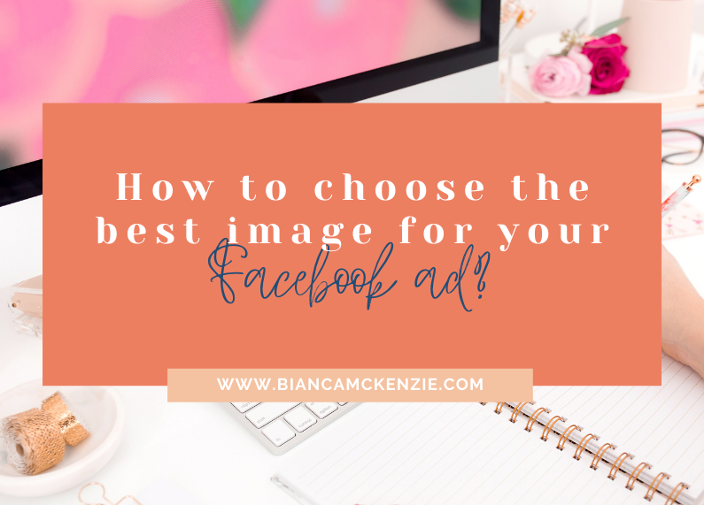
In this post I want to take you through the best practices for selecting Facebook ad images.
We’ll also take a look at some examples so that you get a clear idea of what works and what you should avoid.
Facebook’s best practices
Firstly, we’ll look at what Facebook recommends in terms of images. These are Facebook’s three ad image best practices.
- Choose an image that is relevant to your product or service
- Use an image that is bright and eye-catching, even at a small size
- Avoid images with small details and text, opt for something simple
In my opinion these are good guidelines, but as a marketer I don’t always adhere to these suggestions. I don’t think it’s always a good option to choose an image that’s relevant to your product or service, simply because it might not always be the most attractive option.
Design tips
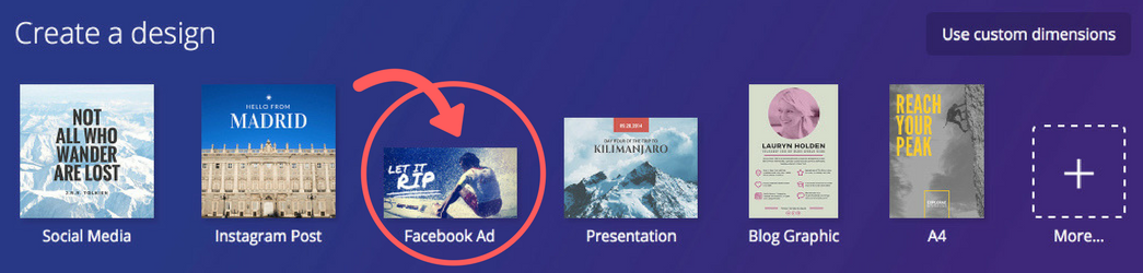
Before we take a look at some image examples, make sure your image is the right size and shape. For all ads, Facebook recommends your image be 1200 pixels wide and 628 high. You’ll find templates already setup for this inside of Canva.
Selecting the best images
Here’s what I think about how to select a good image for your Facebook ads.
1. Stand out through colour
Facebook’s color scheme is blue and white, which means that if you choose similar colours your ads will blend in. To stand out you need to select images with colours that are on the other side of the colour wheel, for example orange, red, hot pink.
Here’s how you can apply this tip:
- Select an image with bright colours
- If your brand uses blue and you want to keep your images ‘on-brand’, create a bright background or border for your ads images
- Ensure the background or border you select contrasts with your chosen image
- Use a bright colour block and add text with a great CTA to your image
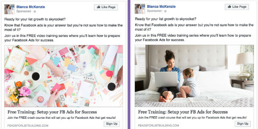
2. Use images of people
Based on research of highly converting images, it was founded that happy people and happy women in particular contribute to high conversions. If possible, use an image of a smiling woman or person in your Facebook ads.
Here’s how you can apply this tip:
- Product based business owners can have a happy woman/person demonstrating their product
- Service-based and online businesses can show a happy woman who has benefitted from their service
- If your business doesn’t have a stock library of images, try to source something that’s on-brand via a stock library.
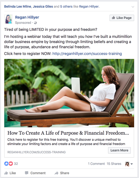
3. Value proposition
A clear value proposition is a great way to attract attention in a busy newsfeed. Lewis Howes, below, uses awesome colors as well as the word “Free” to grab attention:

Here’s how you can apply this tip:
- Use powerful words in your ads images, e.g. Free, Win, Manifest, etc
- Make sure to use strong and vibrant colours to attract attention
4. Resonance
Know your ideal client well enough to be able to predict what type of images would resonate with them. Select images that your ideal client could recognize themselves in, for example it’s something they dream of being or having. Use images that show your ideal client’s dreams or frustrations.
Here’s how you can apply this tip:
- Know your ideal client’s dreams and frustrations and select an image that reflects this
- Focus on what your ideal client most desires (e.g. freedom, lifestyle etc)
5. Test what works
Knowing best practices for Facebook images is extremely valuable, but you should still test your individual images to be sure you’re getting the best results.
I always split test my advertisements – changing only the image to see which people respond best to.
Here’s how you can apply this tip:
- Use Power Editor to create a campaign and, within it, create two or more advertisements
- Run the first advertisement for a set period of time, taking careful note of its metric performance – this advertisement is your ‘control’
- After a defined period of time, publish the next advertisement, changing the image, title, copy or call-to-action (CTA)
- Watch the metric performance for the same period of time to find out which variation performed the best
I hope that’s given you a much better idea of what images work best for Facebook advertisements and how to select your own. Remember to test what works best for your own business, and watch your Facebook newsfeed to see what’s working for others.
Disclosure: Some articles on this site may contain affiliate links, meaning, at no additional cost to you, Bianca McKenzie may earn a commission if you click through and make a purchase.


0 Comments