

Recently I wrote a post about selecting the best image for your Facebook ad, today I want to look at an ad as a whole and go into the anatomy of a Facebook image ad.
Let’s look at an ad that I have used in the past and ‘pull it apart’.
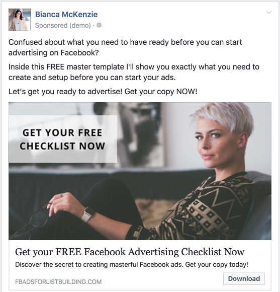
Main text
The text is the first part of your image and this text needs to speak to your ideal client’s dreams, desires or frustrations.
When you write your ad copy, you want to focus on what your ideal audience is struggling with and open with a question or a statement. Opening your ad copy with a question or statement helps your audience with identifying if this offer is for them or not.
In the next part of your ad you focus on what it is that your offer will solve. Explain what you are giving them and how it will solve their struggle.
They should know exactly what they’re going to get and how they’re going to get it.
Image
The next part of the ad is your image, which is one of the most important parts of your ad because it’s often what catches people’s attention in a newsfeed.
To make your image stand out in a newsfeed you can use bold colours that spark attention in a sea of ‘Facebook blue’. The main aim is to select an image that represents you, your brand or your offer and makes people stop scrolling their newsfeed and take action.
It is a great idea to include a call to action on your image to help your audience in their decision to sign up. I have, however, also seen very successful ads that had a blank image where there was no call to action on the image. I recommend testing this for yourself.

Headline
Right underneath the image is your headline, which often focuses on getting people to take an action or describes how it will solve their problem in one strong sentence.
By putting another call to action or strong statement in your ad, you’re increasing the chances that people actually click and take action.
Newsfeed link description
Then you’ll find a little bit of text underneath the headline which Facebook calls the newsfeed link description. This is where you recap some of your offer in a short sentence.
Most people won’t actually read the text description, but if it’s missing your ad doesn’t look finished. I suggest putting in a simple text description that’s in line with your ad overall.
Call to Action (CTA)
Last, make sure you add a Call to Action button to your ad.
You can use the download button, the learn more button, the sign up button. I often use the download button because it tells people that they get to download something.
The download button is not the highest converting call to action button, the ‘learn more’ button is. However, by using the download button, you are telling people what they can expect which in the end generally leads to more conversions. We’re focusing on conversions rather than link clicks.
Recap
In this post we’ve talked about the anatomy of a Facebook image Ad:
- Copy that converts above the image
- An image that stands out
- A strong Call to Action underneath the image
- A Call To Action button
When you spend time to think through and prepare all of these pieces with care, you end up with a high converting Facebook ad that will increase your list size, and also has the potential to increase your revenue.
Start creating your own converting Facebook ads and if you haven’t yet, make sure that you download your free Facebook Ads Checklist.


0 Comments